Cut back then cut back again. Evolving Jack Morton’s brand identity.
Project overview
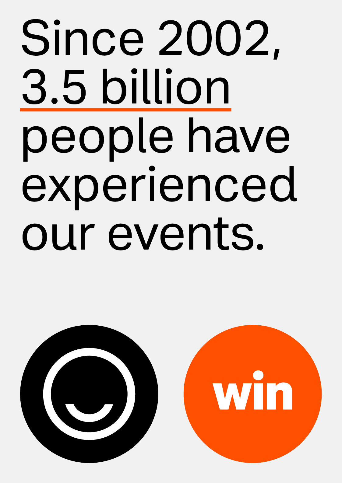
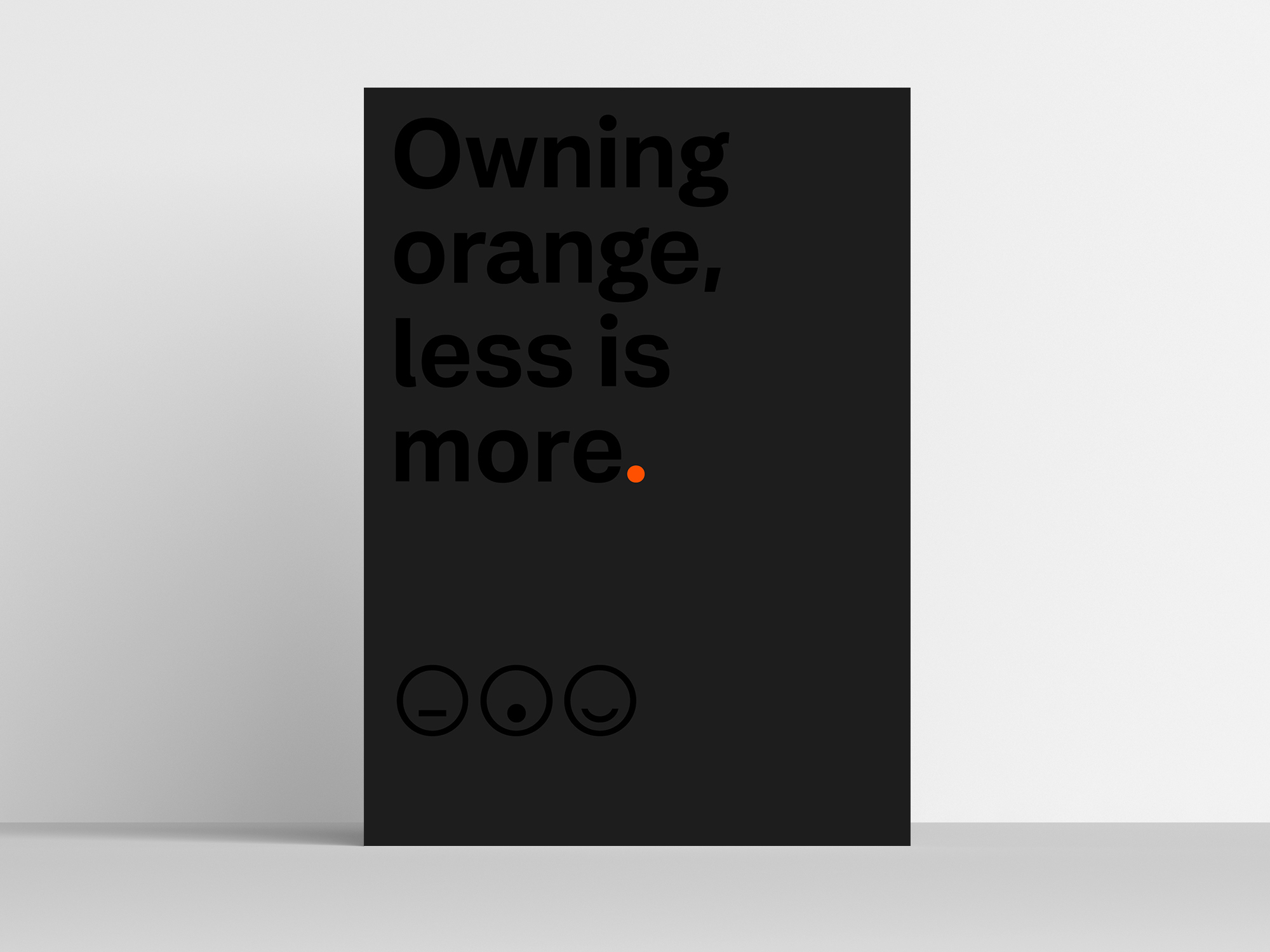
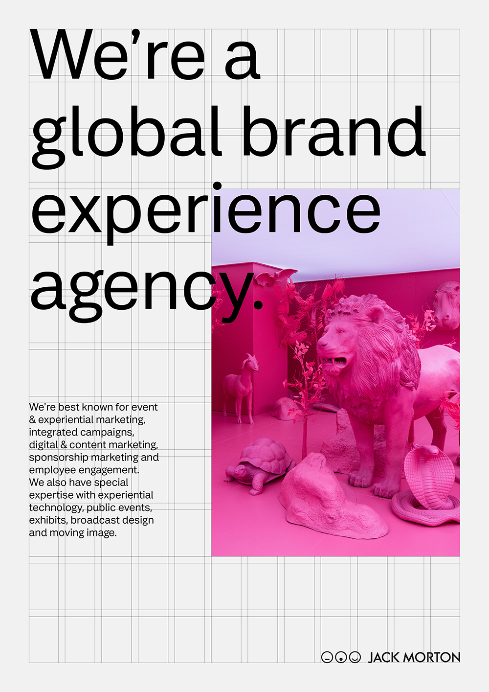
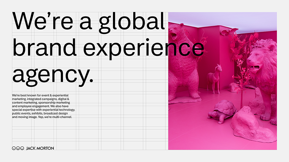
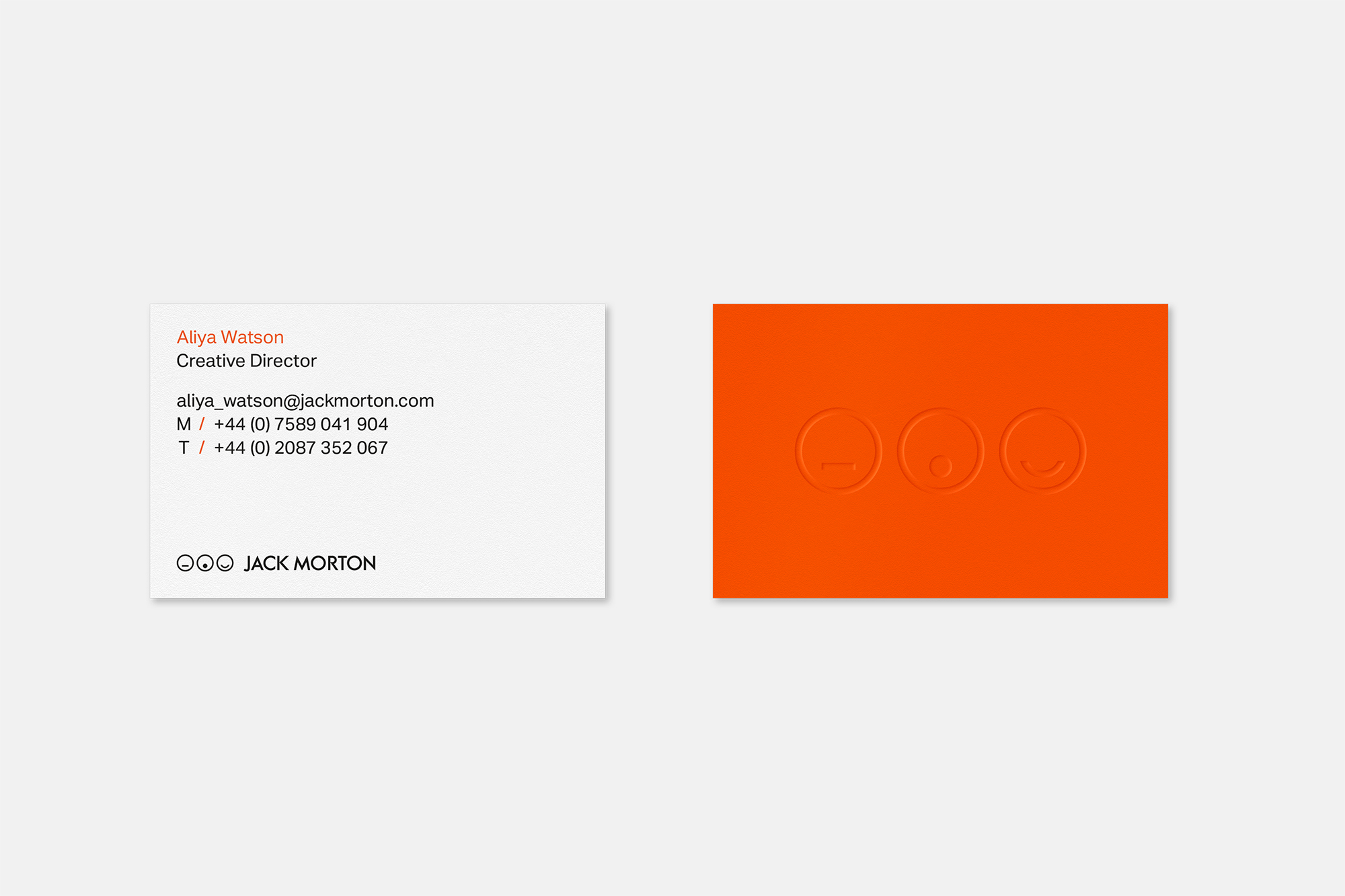
After conducting a thorough audit of the existing brand, it became clear that a simpler approach was needed across all visual elements, embracing a ‘less is more’ philosophy to let the work take centre stage.
We established clear design principles to guide the creation of a new visual language, focusing on clarity and consistency, particularly for Jack Morton’s digital and social channels.
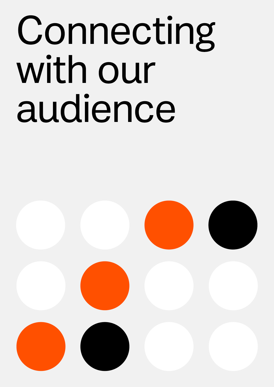
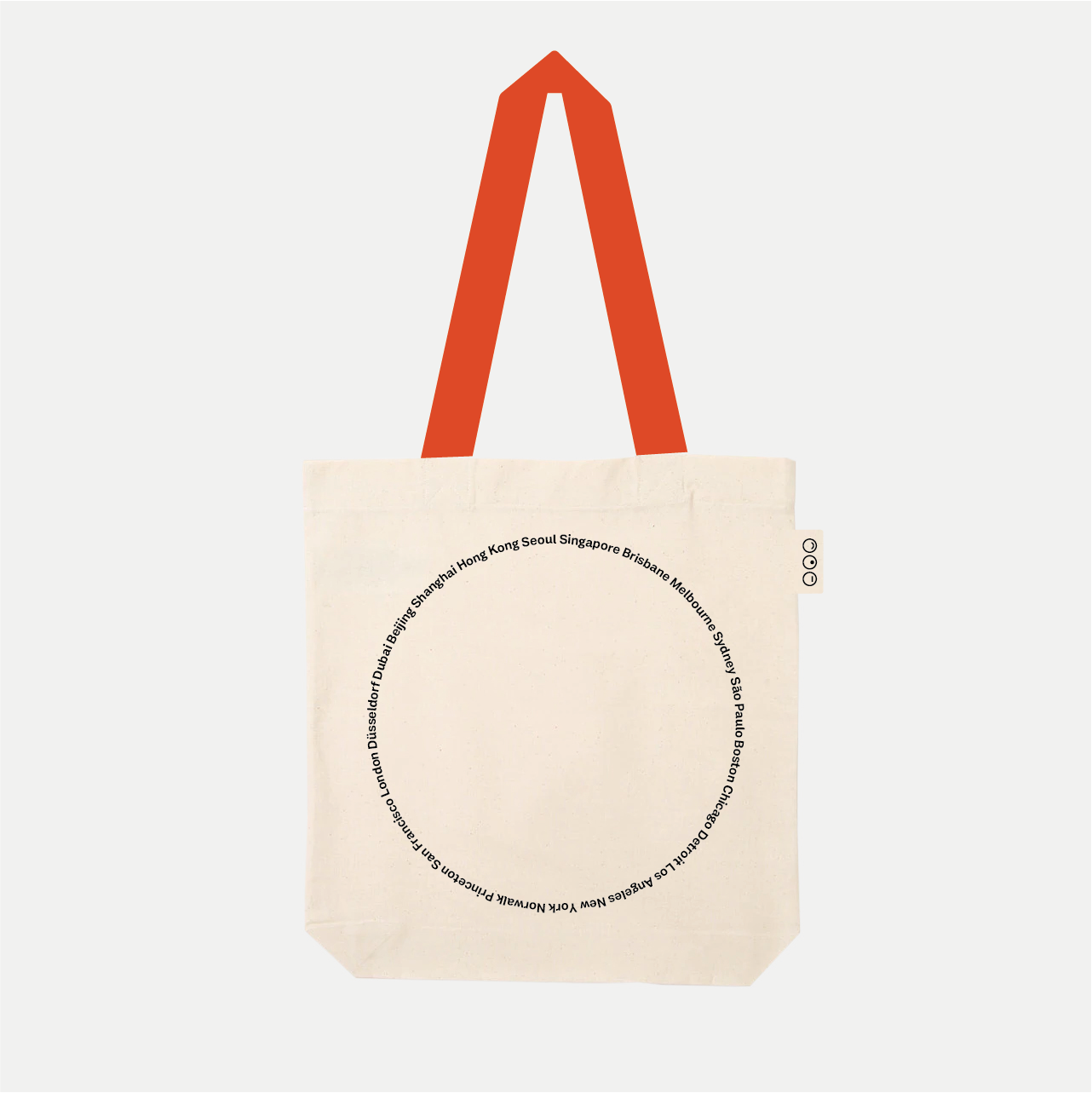
The most notable change was the development of a bespoke typeface, ‘Irvin Sans’, named after founder Irvin Leonidas ‘Jack’ Morton, designed in collaboration with Dalton Maag.
After conducting a thorough audit of the existing brand, it became clear that a simpler approach was needed across all visual elements, embracing a ‘less is more’ philosophy to let the work take centre stage.
We established clear design principles to guide the creation of a new visual language, focusing on clarity and consistency, particularly for Jack Morton’s digital and social channels.
The most notable change was the development of a bespoke typeface, ‘Irvin Sans’, named after founder Irvin Leonidas ‘Jack’ Morton, designed in collaboration with Dalton Maag.
Agency: Jack Morton
Project: Jack Morton brand evolution
Role: Design Director
Photography: Jane Stockdale
︎︎︎
Project: Jack Morton brand evolution
Role: Design Director
Photography: Jane Stockdale
︎︎︎
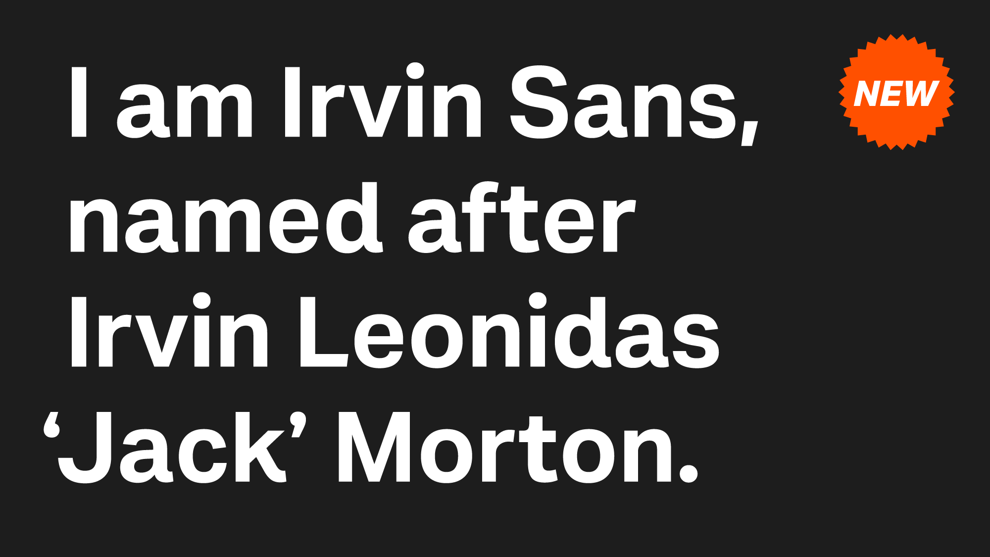

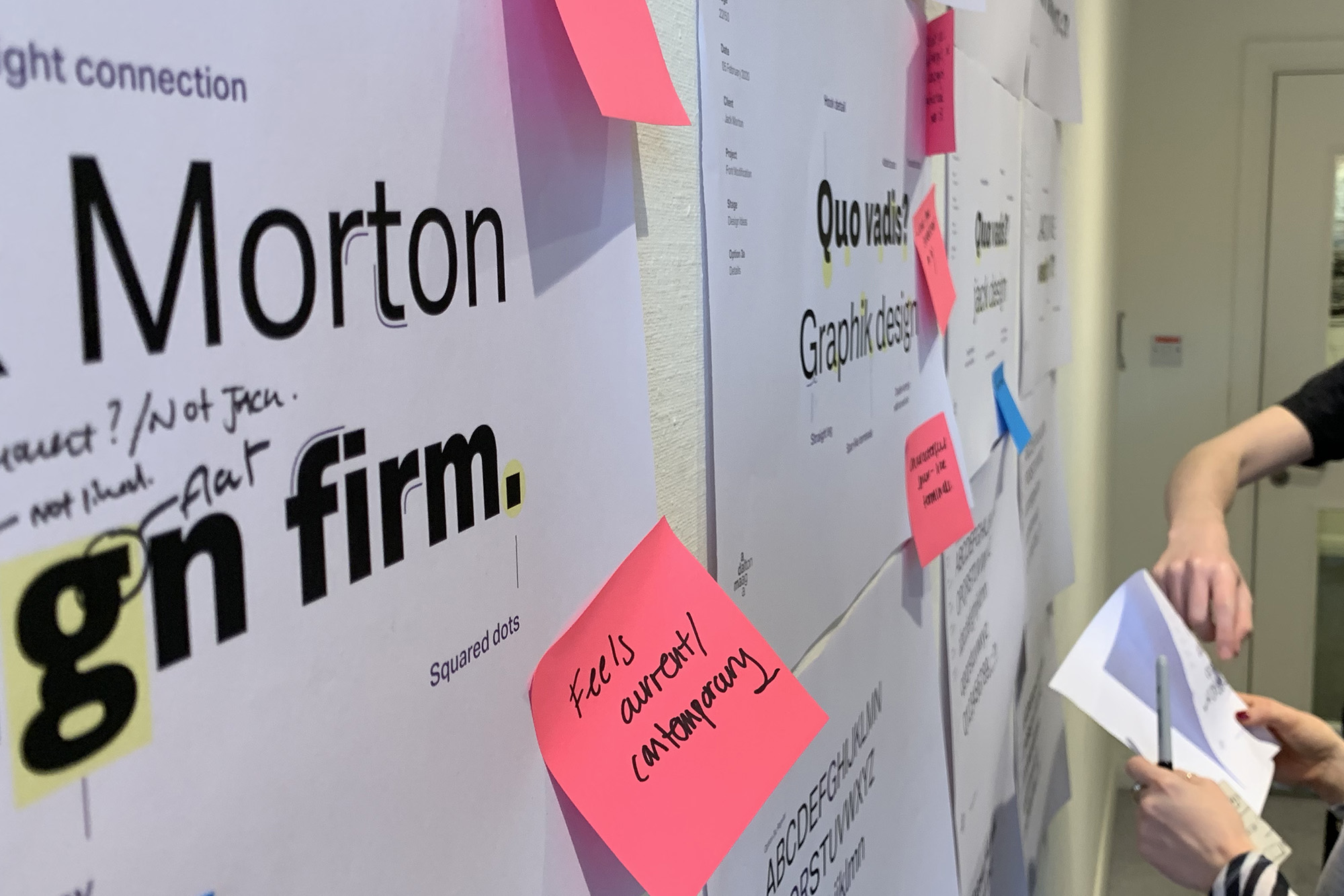
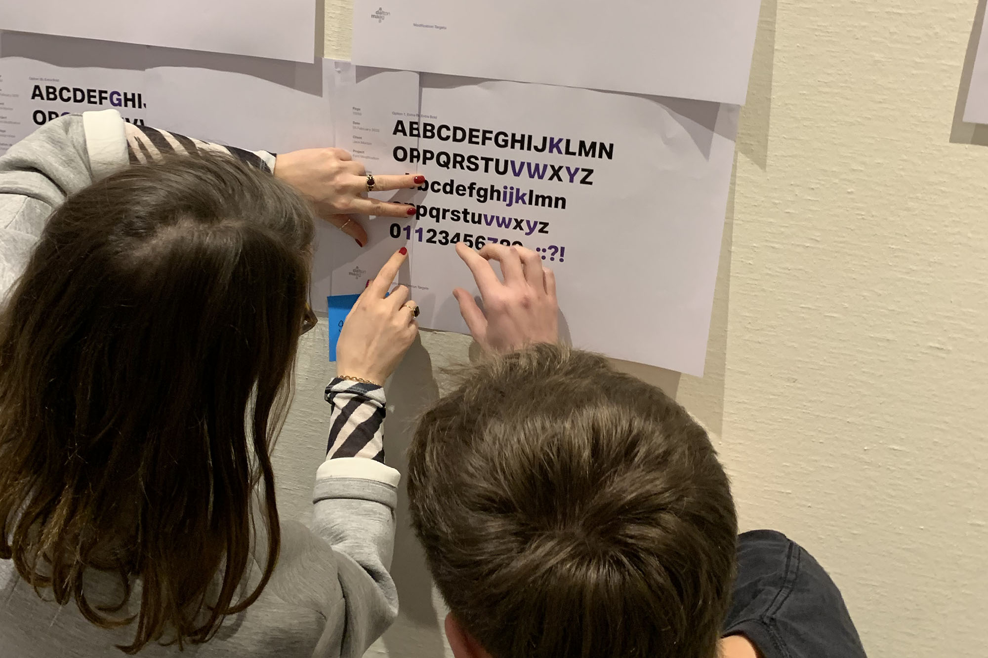

Irvin Sans feels warm, simple, and robust. When blown up to larger sizes, the personality of the modified characters can be truly appreciated.
Eleni Beveratou, Creative Director, Dalton Maag