A visual identity for Jack Morton’s innovation practice.

Project overview
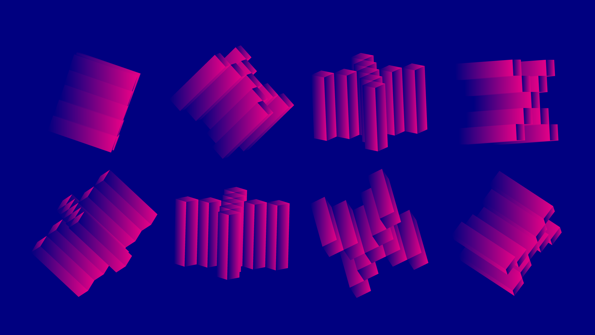
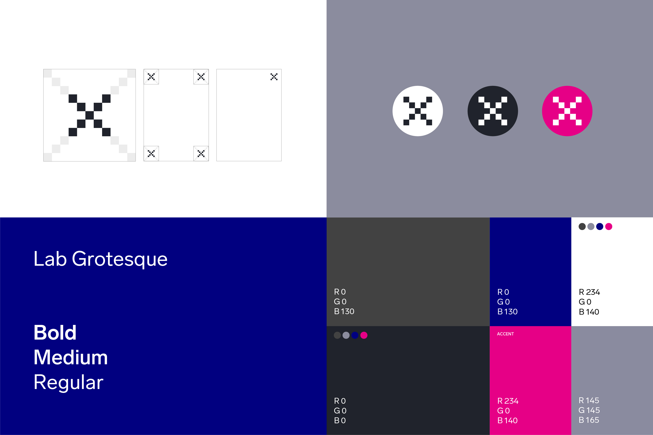
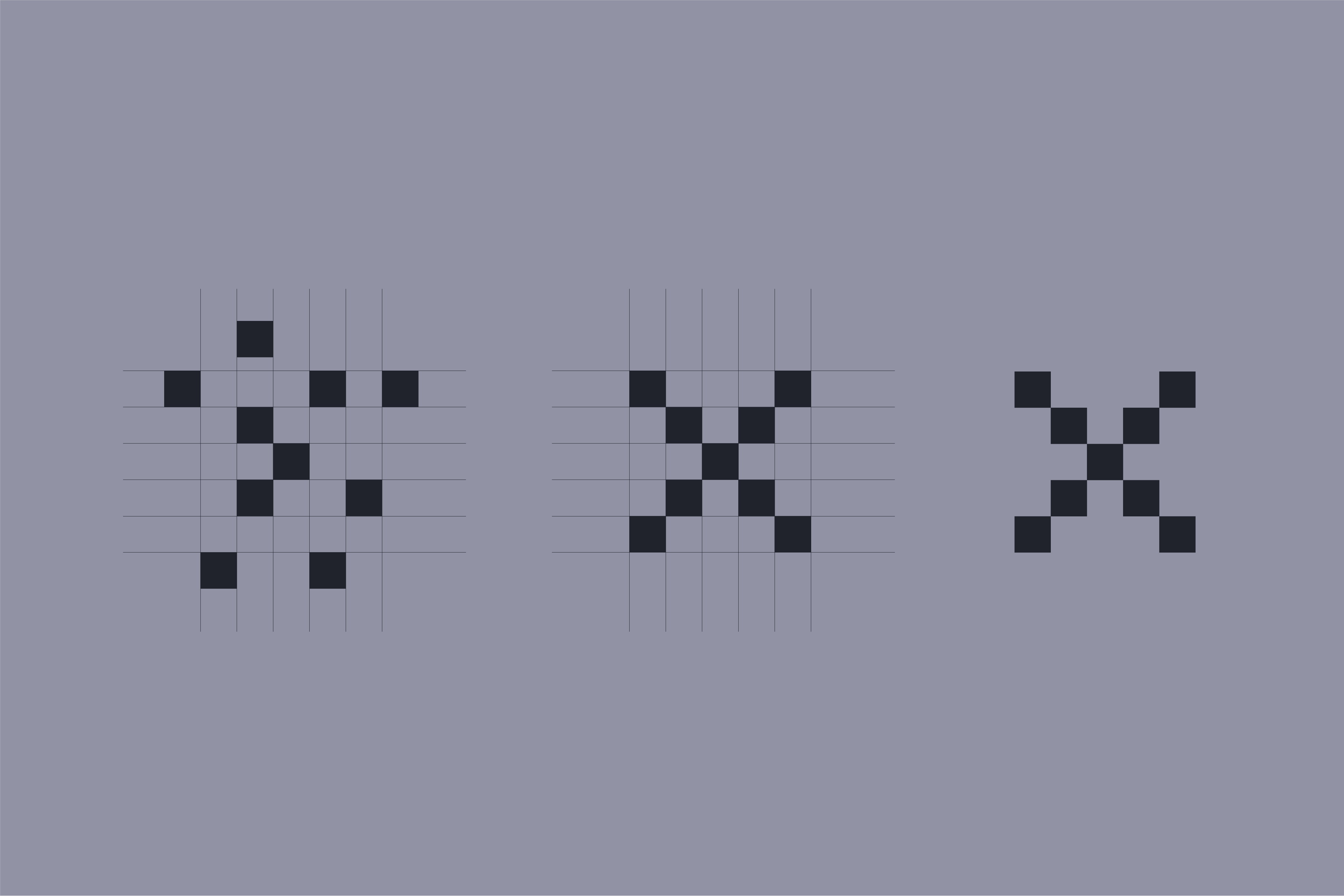
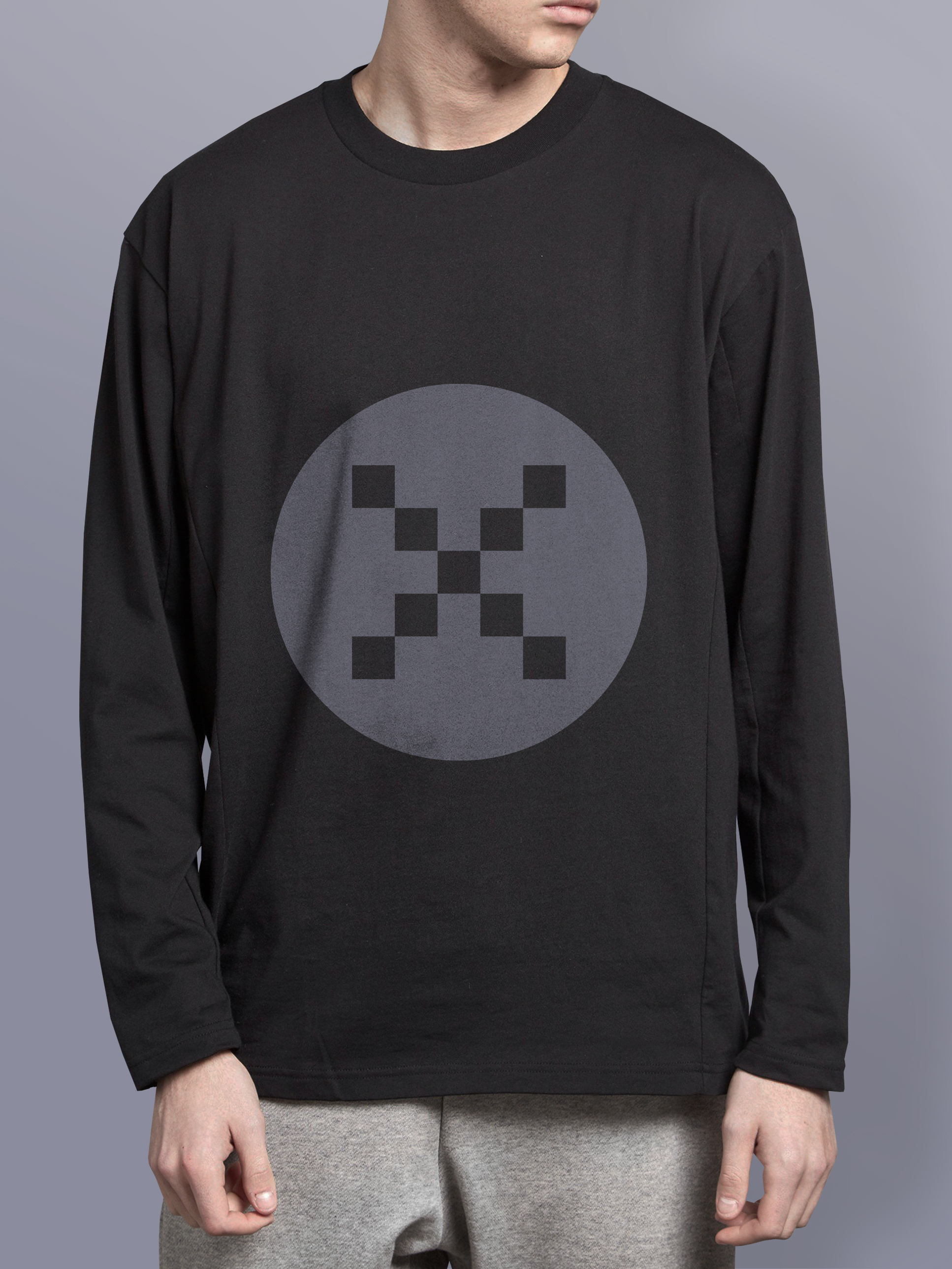
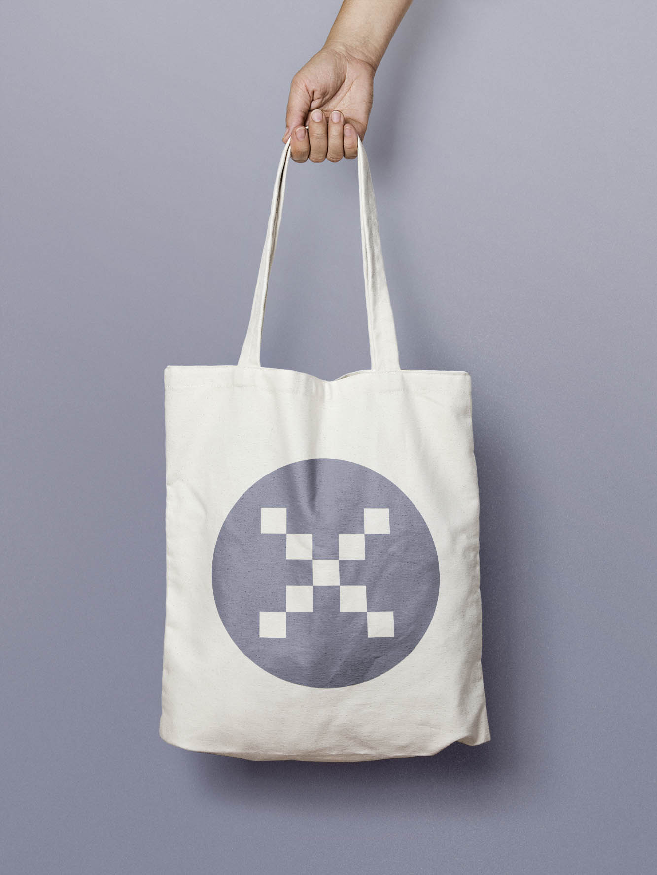
The idea behind the ‘X’ mark for Jack Morton’s innovation practice was that successful innovation comes from bringing together many minds to offer different perspectives. In graphic terms, this means multiple components combining to form a unified whole.
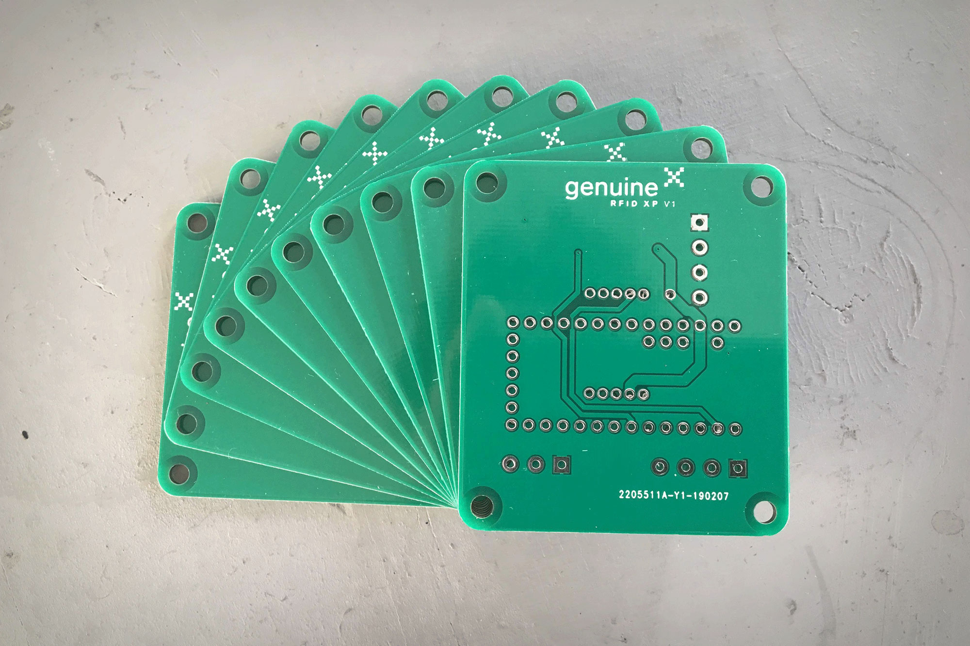
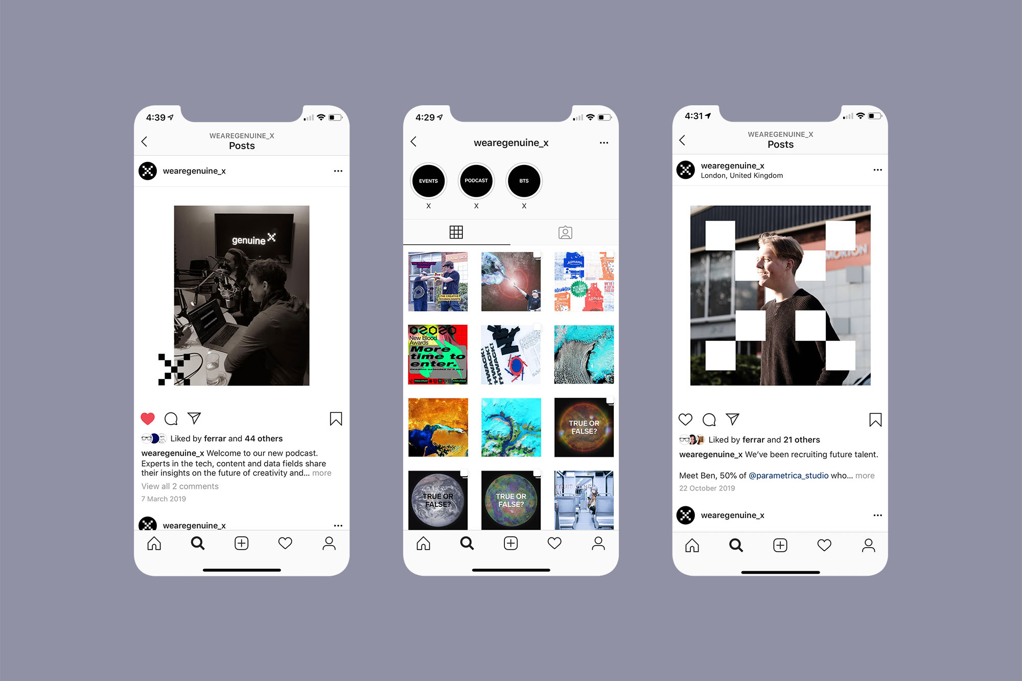
Squares were built on a grid, allowing the components of the ‘X’ to adapt, change, and animate to suit various purposes. The design was carefully considered and optimised to work effectively at favicon scale, cutting through visual noise both in browsers and on social media.
The idea behind the ‘X’ mark for Jack Morton’s innovation practice was that successful innovation comes from bringing together many minds to offer different perspectives. In graphic terms, this means multiple components combining to form a unified whole.
Squares were built on a grid, allowing the components of the ‘X’ to adapt, change, and animate to suit various purposes. The design was carefully considered and optimised to work effectively at favicon scale, cutting through visual noise both in browsers and on social media.
Agency: Jack Morton
Project: Jack Morton X
Role: Design Director
︎︎︎
Project: Jack Morton X
Role: Design Director
︎︎︎
Rotational values on axis X, Y & Z. Coordinates created
using Google random number generator.
︎